Here is my 2010 school research paper. Because I am interested in photography, I decided to make that the topic of my paper. At the public library, I checked out as many books as I could find about photography and worked with mom to write notecards about the particular points I wanted to discuss. Most of the books were at least 15 years old, so they didn’t cover digital photography. Fortunately, the basic principles of photography remain the same. Now, without further ado, I give you THE paper!
When my brother was ten, he thought that an expensive baseball bat would make him like Babe Ruth. Of course, once he got one, he found out that the bat didn’t make him a pro. The same thing is true in most fields, including photography. I got my first little camera when I was eleven. I thought that only really expensive cameras could take good pictures. As I looked into photography, I found it is not only the camera but the understanding of photography that will make good pictures. Composition, color, and lighting are three important aspects of photography. Understanding them is the first step to understanding photography.
Composition
The first important aspect of photography is composition. Composition is the organization of the main subject, foreground and background of your picture. A good composition should lead the eye towards your main subject and then to the background.
A good way to start is to decide the main subject of your picture. You should think about the shape and form of your subject. Shape refers to the 2D outline of your subject, and form refers to the 3D outline. Math shapes such as triangles (mountains, and rooftops), circles (ponds, balls) and squares and rectangles (diving boards, cliffs) capture the eye’s attention.

Sidelighting and low point-of-view make this snapshot more dramatic.
You should always highlight interesting forms, which usually are your main subject. One way to do this is to direct the light towards the object. This can be done with a reflector if light is not shining on the object. (To make a reflector, see Photography Projects.) Secondly, silhouettes bring out the shape rather than form of an object. A third way to highlight your subject is to use foreground interest. This means using nonessential objects in the front to deepen your composition. The objects in the foreground should relate to a color in the composition or another object.
Another way to compose a picture is to focus on the texture and pattern of an object rather than its shape or form. A way you can see textures and patterns is to do the “squint test”. When you squint, textures and patterns stand out. These two things will be most noticed when the camera is focused on the foreground and the background is blurry.

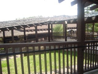
Different sizes of vertical lines create interest.
Composition should also include point of view. Most pictures are taken from eye level, but your object will look way more interesting if you move your camera up or down. That is why I say that point of view is probably the most important aspect of photography. You may never think that an object is interesting until you think of a new point of view.
First, you need to decide if you are going to take your picture in landscape format or portrait format. Landscape format is another name for horizontal, and portrait is another name for vertical. Landscape format pictures are peaceful and harmonizing. Portrait format has a great sense of energy.
If you don’t know where to put your object in the frame, the rule of thirds works great. The rule of thirds is two imaginary lines going up and down and two going right and left. You should place your main subject in a box to the side. If your object is a person, you should have him looking towards the center box, but not be positioned in the center. This rule can be broken especially if you are doing the linear perspective. The linear perspective is when two or more lines seem to meet. The linear perspective looks great when an an object is placed at the end of the lines. The linear perspective is good for showing distance, too.

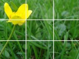
Grid showing the rule of thirds.

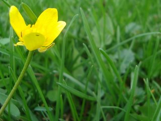
Rule of thirds provides more pleasing composition.
Other ways to show distance are the aerial perspective, overlapping form, and diminishing scale. The aerial perspective is when colors seem to fade in the distance; overlapping form is when objects overlap. And diminishing scale is when objects look smaller farther away. You should also think about the size of your object. If the size of your main subject will be ambiguous in the composition, you should put something in your picture to show how big the subject really is. However, you could also leave it ambiguous to create a mysterious composition. It is always good to cover-up something that is uninteresting or distracting in your composition if you can’t move it. This technique is called framing. Half framing is when you put an object very close up on half the picture and then have an object farther away in the other half.
Color

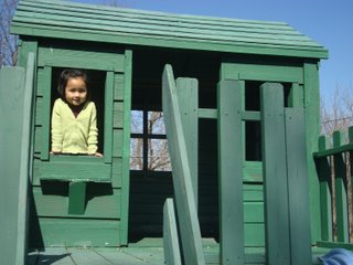
The yellow sweater draws your attention to the girl. This also demonstrates the rule of thirds.
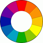
Although color can be a part of composition, it is a big enough category to be by itself. Color and tone (the range from light to dark) create a feeling for your picture. Light tones for the most part are happy; dark tones are somber. You should also know that generally the primary light tone is yellow and primary dark tone is blue. Color combinations are the key to making a good color composition. Colors next to each other on the color wheel are harmonizing and are called harmony colors. And colors opposite on the color wheel have a sense of energy and are complementary to each other. Dark green and beige, navy blue and gray, and lavender and mauve are color combinations that are soothing to the eye. Colors are beautiful, but too many will create confusion and distraction. You should have a main color in your picture. The main color should stand out the most. Red and yellow have a stunning shine when they are put in dull backgrounds. Bright backgrounds will highlight neutral objects just like neutral backgrounds highlight bright objects.
Red, green and blue are the primary (starting) colors. All the other colors are made from combinations of them, so they are the brightest colors and attract the most attention. These three together make a good color composition. Red seems to advance towards the viewer and blue recedes. Monochromatic (one-color) backgrounds are perfect for showing textures and patterns. The calming background points right to the textures and patterns, making them show in a way primary colors wouldn’t.

The basic color wheel.
Color is in light, too. There’s color in artificial light and in natural light. You need to understand the colors in light when you photograph, because light colors will not look the same when you photograph them. First, I will tell you about the color of natural light. Light will show as true white best under a noon sun in a clear sky. If the sun is behind clouds or if there is fog, the light will have a bluish tint to it. The closer the sun is to the horizon, the yellower the light will get. Dust and low sun will diffuse light and reduce the contrast between the background and your subject. If your main subject is a person, make sure to take the picture in the shade. Direct overhead light will make shadows over the face. But be careful not to get too close to greenery because greenish tones will show on the person’s face.
Secondly, the colors of artificial light are especially tricky to work with. Each and every one has a different color and will affect the color in your picture. Incandescent bulbs show up as yellow/white, similar to early morning or late afternoon sun. Fluorescent bulbs appear greenish. Street lights have mercury bulbs in them and these will appear green/blue. Sodium vapor bulbs will have a yellow or red yellow light; tungsten, yellow/orange. An electric flash on the camera is true white light, and neon lights will show as what they appear to the eyes.
Light

Side- and back-lighting create fantasy.
Composing a picture and deciding on color are important for the photographer. Understanding light is also crucial for good photographs. How much light will enter the camera depends on two functions: aperture and shutter speed. Aperture is the size of the lens opening. Each aperture setting is called an f-stop. The standard settings range from f1.4 to f32. Every f-stop halves or doubles the light coming in. The smaller the number, the bigger the opening. Your aperture size will affect the range of focus. A small aperture (f22) will have a large range of focus. A large aperture (f1.4) will only allow the main object to be in focus. Shutter speed refers to how long the shutter stays open to let light enter the lens to shine on the film or sensor that captures the image. It is important to have the right combination of aperture and shutter speed to make sure that the picture will not be too dark or washed out. Sometimes, though, you should let part of your picture be washed out to get the right amount of light on your main subject.
Not only is the amount of light important but where the light is coming from is also crucial to a picture’s composition. There are four lighting positions: front lighting, top lighting, side lighting, and back lighting. Front and top lighting shines on what is facing the camera. These two work best outside. The advantage of them is that there are few shadows, but the disadvantage is the objects will look flat, especially natural objects like mountains. Side lighting is at a right angle to the camera. This kind of lighting will bring out textures and patterns. Back lighting is light coming towards the camera. It is good for portraits, still life, and the inside of architectural structures. Using this kind of lighting will make dramatic silhouettes, bringing out the form of your object.
Conclusion
Composition, color and lighting are the three main guiding posts in photography that I have explored and described. Recently, I have been experimenting with these in my own picture-taking. I only have a simple point-and-shoot digital camera, so I can’t do some of the fancier techniques like adjusting aperture and shutter speed. But I have been amazed at how many aspects of photography composition, color and lighting that I have been able to explore. It is fun learning how to organize the components of a photograph, to understand how colors harmonize, and to use different lighting to create a work of art. I encourage you to work and improvise with these ingredients to develop your own style and flair.
Below is a more complete slide show of 33 photographs of mine illustrating composition, color and lighting. The pictures change every 7 seconds, so you have time to read the captions and look at the pictures:
Bibliography
- Bavister, Steve. 2000. Digital Photography. NY: Sterling Publishing Co.
- Hedgecoe, John. 1978. The Art Of Color Photography. NY: Simon & Schuster.
- Jacobs Jr, Lou. 1991. Available Light Photography: How To Shoot Without Flash In All Kinds Of Light. NY: AM PHOTO.
- Rowinski, Tim & Kate. 1999. L.L. Bean Outdoor Photography Handbook. NY: The Lyons Press.
- Zuckerman, Jim. 1998. Jim Zuckerman’s Secrets Of Color In Photography. Cincinnati, OH: Writer’s Digest Books.

